By Chainika Thakar and Jay Parmar
Python is known to be the most popular programming language today ⁽¹⁾. Further, Python Matplotlib is a way of visualising the data. It is quite essential to have accessible ways to view and understand the data’s impact with the help of graphs or plots.
Let us now learn more about visualising data with Python Matplotlib with this blog that covers:
- What is Python Matplotlib?
- Why do we need data visualisation?
- Basic terms and concepts in Matplotlib
- Plotting data in Python Matplotlib
- Plot customization using Python Matplotlib
- Multiple plots using Python Matplotlib
What is Python Matplotlib?
Matplotlib is a popular Python library that can be used to create data visualisations quite easily. It is probably the single most used Python package for 2D graphics along with limited support for 3D graphics.
It provides both a rapid way to visualise data from Python and publication-quality figures in many formats. Also, It was designed from the beginning to serve two purposes:
- Allow for interactive, cross-platform control of figures and plots
- Make it easy to produce static vector graphics files without the need for any GUIs.
Much like Python itself, Matplotlib gives developers complete control over the appearance of their plots. It tries to make easy things easy and hard things possible. We can generate plots, histograms, power spectra, bar charts, error charts, scatter plots, etc., with just a few lines of code.
Python For Trading
Get started in Python programming and learn to use it in financial markets.
For simple plotting, the pyplot module within the matplotlib package provides a MATLAB-like interface to the underlying object-oriented plotting library. It implicitly and automatically creates figures and axes to achieve the desired plot.
For importing Python matplotlib you simply need to first install matplotlib and then import the same by using these commands-
Why do we need data visualisation?
The importance of data visualisation is simple: it helps people see, interact with, and better understand data. Whether simple or complex, the right visualisation can bring everyone on the same page, regardless of their level of expertise.
It’s hard to think of a professional industry that doesn’t benefit from making data more understandable ⁽²⁾. Every STEM field benefits from understanding data—and so do fields in government, finance, marketing, history, consumer goods, service industries, education, sports, and so on.
While we’ll always wax poetically about data visualisation (you’re on the Tableau website, after all), there are practical, real-life applications that are undeniable. And, since visualisation is so prolific, it’s also one of the most useful professional skills to develop. The better you can convey your points visually, whether in a dashboard or a slide deck, the better you can leverage that information.
As the skill sets are changing to accommodate a data-driven world, it is increasingly valuable for professionals to be able to use data to make decisions. Moreover, the visuals help to tell the detailed stories of the who, what, when, where, and how.
While traditional education typically draws a distinct line between creative storytelling and technical analysis, the modern professional world also values those who can cross between the two: data visualisation sits right in the middle of analysis and visual storytelling.
Basic terms and concepts in Matplotlib
Python Matplotlib allows creating a wide variety of plots and graphs. Matplotlib is a large project and can seem daunting at first. However, we will start learning the components, and it should feel much smaller and approachable.
Different sources use 'plot' to mean different things. So let us begin by defining specific terminology used across the domain.
- Figure is the top-level container in the hierarchy. It is the overall window where everything is drawn. We can have multiple independent figures, and each figure can have multiple Axes. It can be created using the figure method of pyplot module.
- Axes is where the plotting occurs. The axes are effectively the area that we plot data on. Each Axes has an X-Axis and a Y-Axis.
The example mentioned below illustrates the use of the above-mentioned terms:
Upon running the above example, nothing happens really. It only creates a figure of size 432 x 288 with 0 Axes. Also, Python Matplotlib will not show anything until told to do so. Python will wait for a call-to-show method to display the plot.
This is because we might want to add some extra features to the plot before displaying it, such as title and label customisation. Hence, we need to call plt.show() method to show the figure as shown below:
As there is nothing to plot, there will be no output. While we are on the topic, we can control the size of the figure through the figsize argument, which expects a tuple of (width, height) in inches.
Axes
All plotting is done concerning an Axes. An Axes is made up of Axis objects and many other things. An Axes object must belong to a Figure. Most commands that we will ever issue in Python Matplotlib will be concerning this Axes object.
Typically, we will set up a Figure, and then add Axes on to it. We can use fig.add_axes but in most cases, we find that adding a subplot fits our need perfectly. A subplot is an axes on a grid system.
add_subplot method adds an Axes to the figure as part of a subplot arrangement.
Figure 1
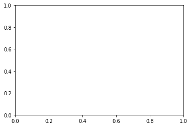
The above code adds a single plot to the figure fig with the help of theadd_subplot method.The output we get is a blank plot with axes ranging from 0 to 1, as shown above.
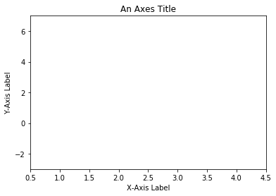
In Python Matplotlib, we can customise the plot using a few more built-in methods. Let us add the title, X-axis label, and Y-axis label, and set the limit range on both axes. This is illustrated in the below code snippet.
Figure 2
Python Matplotlib's objects typically have lots of explicit setters, i.e. methods that start with set_something and control a particular option. Setting each option using explicit setters becomes repetitive, and hence we can set all required parameters directly on the axes using the set method as illustrated below:
The set method does not apply to Axes; it applies to more-or-less all Python Matplotlib objects.
The above code snippet has the same output as figure 2 above using the set method with all required parameters passed as arguments to it.
Axes method v/s Pyplot
Interestingly, almost all methods of axes objects in Python Matplotlib exist as a method in the pyplot module. For example, we can call plt.xlablel('X-Axis Label') to set the label of X-axis (plt being an alias for pyplot), which in turn calls ax.set_xlabel('X-Axis Label') on whichever axes is current.
Figure 3
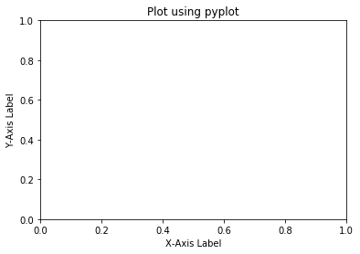
The code above is a bit easier and has fewer variables to construct a plot. It uses the implicit calls to axes method for plotting. However, if we take a look at "The Zen of Python" (try import this), it says:
"Explicit is better than implicit."
While very simple plots with short scripts would benefit from the conciseness of the pyplot implicit approach, when doing more complicated plots or working within larger scripts, we will want to explicitly pass around the axes and/or figure object to operate upon. We will be using both approaches in this Python Matplotlib tutorial wherever it deems appropriate.
Anytime we see something like the below:
can be replaced with the following:
Both versions of the code produce the same output. However, the latter version is cleaner.
Multiple Axes
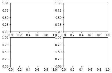
A figure can have more than one Axes on it. In Python Matplotlib, the easiest way is to use plt.subplots() call to create a figure and add the axes to it automatically. Axes will be on a regular grid system. For example,
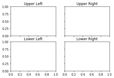
Upon running the above code, Python Matplotlib would generate a figure with four subplots added arranged in two rows and two columns as shown below:
Figure 4
The axes object that was returned here would be a 2D-NumPy array, and each item in the array is one of the subplots. Therefore, when we want to work with one of these axes, we can index it and use that item's methods. Let us add the title to each subplot using the axes methods.
The above code created a figure with four subplots and shared X and Y axes. Axes are shared among subplots in row-wise and column-wise manner. We then set a title to each subplot using the set method for each subplot. Subplots are arranged in a clockwise fashion, with each subplot having a unique index. The output is shown below:
Figure 5
Plotting data in Python Matplotlib
So far in this Python Matplotlib tutorial, we have discussed a lot about laying things out, but we haven't discussed anything about plotting data yet. Python Matplotlib has various plotting functions. Many more that we will discuss and cover here. However, a full list or gallery can initially be a bit overwhelming.
Hence, we will condense it down and attempt to start with simpler plotting and then move towards more complex plotting. The plot method of pyplot is one of the most widely used methods in Python Matplotlib to plot the data. The syntax to call the plot method is shown below:
The coordinates of the points or line nodes are given by x and y. The optional parameter fmt is a convenient way of defining basic formattings like color, market, and style. The plot method is used to plot almost any kind of data in Python. It tells Python what to plot and how to plot it, and also allows customisation of the plot being generated, such as color, type, etc.
Line Plot
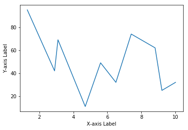
In Python Matplotlib, a line plot can be plotted using the plot method. It plots Y versus X as lines and/or markers. Below we discuss a few scenarios for plotting line. To plot a line, we provide coordinates to be plotted along X and Y axes separately as shown in the below code snippet.
The above code plots values in the list x along the X-axis and values in the list y along the Y-axis. The output is shown below:
Figure 6
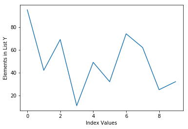
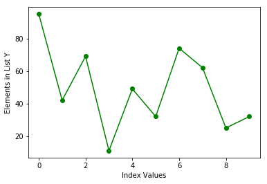
The call to plot takes the minimal arguments possible, i.e. values for Y-axis only. In such a case, Python Matplotlib will implicitly consider the index of elements in list y as the input to the X-axis as demonstrated in the below example:
Here, we define a list called y that contains values to be plotted on Y-axis. The output is shown below:
Figure 7
The plots created above use the default line style and color. The optional parameter fmt in the plot method is a convenient way for defining basic formattings like color, marker, and line-style. It is a shortcut string notation consisting of color, marker, and line:
Each of them is optional. If not provided, the value from the style cycle is used. We use this notation in the below example to change the line color:
Figure 8
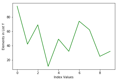
Following the fmt string notation, we changed the color of a line to green using the character g which refers to the line color. Likewise, markers are added using the same notation as shown below:
Figure 9
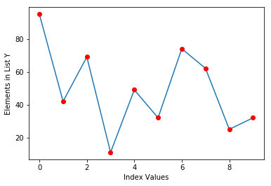
Here, the fmt parameters g refers to the green color, o refers to circle markers and - refers to a continuous line to be plotted. This formatting technique allows us to format a line plot in virtually any way we like. It is possible to change the marker style by tweaking the marker parameter in the fmt string as shown below:
Figure 10

In the above plots, the line and markers share the same color, i.e. green specified by the fmt string. If we are to plot lines and markers with different colors, we can use multiple plot methods to achieve the same.
Figure 11
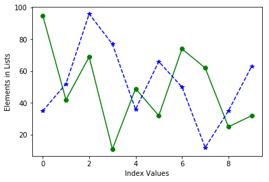
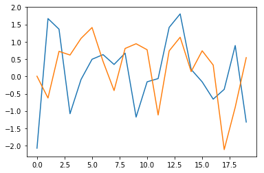
The above code plots line along with red circle markers. Here, we first plot the line with the default style and then attempt to plot markers with attributes r referring to red color and o referring to circle. On the same lines, we can plot multiple sets of data using the same technique. The example given below plots two lists on the same plot.
Figure 12
We can achieve the same result as shown above using the different techniques as shown below:
Essentially, the plot method makes it very easy to plot sequential data structures such as lists, NumPy arrays, pandas series, etc. Similar to plotting lists, we can plot NumPy arrays directly via the plot method.
Let us plot NumPy one-dimensional array. As we are executing codes directly in the IPython console, calling the plt.show() is not required and hence, we will not be calling the same in subsequent examples.
However, remember, it is necessary to call it while writing Python code to show a plot.
Figure 13
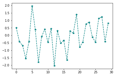
In the above example, we draw thirty samples from a normal distribution into an array arr which, in turn, gets plotted in a dashed line along with asterisk markers. Plotting two-dimensional arrays follows the same pattern. We provide a 2-D array to a plot method to plot it.
Figure 14
Let us now move our focus to plot pandas data structures. The pandas library uses the standard convention of Python Matplotlib for plotting directly from its data structures. The pandas also provide a plot method which is equivalent to the one provided by Python Matplotlib.
Hence, the plot method can be called directly from pandas Series and DataFrame objects. The plot method on Series and DataFrame is just a simple wrapper around plt.plot(). The below example illustrates plotting pandas Series object:
Figure 15
In the above example, we call the plot method directly on pandas Series object ts. Alternatively, we could have called plt.plot(ts). Calling ts.plot() is equivalent to calling plt.plot(ts) and both calls would result in almost the same output as shown above.
Additionally, the plot() method on the pandas object supports almost every attribute that plt.plot() supports for formatting. For example, calling the plot method on pandas objects with a color attribute would result in a plot with color mentioned by its value. This is shown below:
Figure 16
Moving forward, the same notation is followed by pandas DataFrame object and visualizing data within a dataframe becomes more intuitive and less quirky. Before we attempt to plot data directly from a dataframe, let us create a new dataframe and populate it.
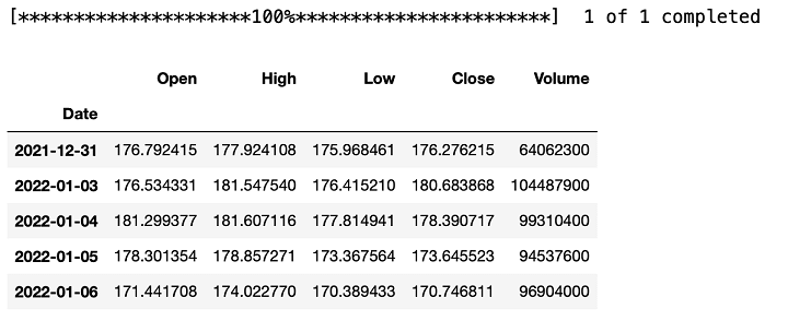
We fetch the stock data of AAPL ticker that we will be used for illustration purposes throughout the remaining part of the Python Matplotlib tutorial.
Script to fetch AAPL data from a web resource:
The dataframe data will contain stock data with dates being the index. The excerpt of the downloaded data is shown below:
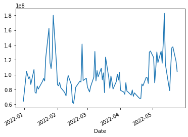
Now we can plot any column of a data dataframe by calling the plot method on it. In the example given below, we plot the recent 100 data points from the Volume column of the dataframe:
Figure 17
With a dataframe, the plot method is convenient to plot all of the columns with labels. In other words, if we plot multiple columns, it would plot the labels of each column as well.
Figure 18

The plot method generates a line plot by default when called on pandas data structures. However, it can also produce a variety of other charts as we will see later in this Python Matplotlib tutorial. Having said that, let us head forward to plot scatter plots.
Scatter Plot
In Python Matplotlib, scatter plots are used to visualize the relationship between two different data sets. Python Matplotlib provides the scatter method within pyplot sub-module using which scatter plots can be generated.
- plt.scatter generates a scatter plot of y vs x with varying marker size and/or color.
The x and y parameters are data positions and it can be array-like sequential data structures. There are some instances where we have data in the format that lets us access particular variables with string.
For example, Python dictionary or pandas dataframe. Python Matplotlib allows us to provide such an object with the data keyword argument to the scatter method to directly plot from it. The following example illustrates this using a dictionary.
Figure 19
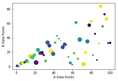
In the above code, we created a dictionary with four key-value pairs. Values in keys a and b contain fifty random values to be plotted on a scatter plot. Key c contains fifty random integers and key d contains fifty positive floats which represent color and size respectively for each scatter data point.
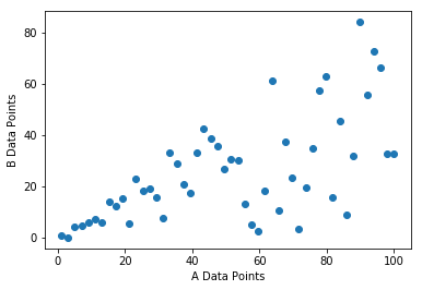
Then, a call to plt.scatter is made along with all keys and the dictionary as the value to data. Argument c within the call refers to the color to be used and argument s represents the size of a data point. These arguments c and s are optional. A simple scatter plot with the same color and size gets plotted when we omit these optional arguments as shown in the following example:
Figure 20
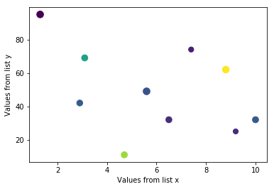
To better understand the working of scatter plots, let us resort to our old friends: lists x and y that we defined earlier while learning line plots and building scatter plots on them. To refresh our memory, we re-define the same lists below:
In addition to these lists, we would be defining two more NumPy arrays color and size which determines the color and size respectively of each data point while plotting the scatter plot.
Now that we have data points ready, we can plot a scatter plot out of them as below:
The scatter plot would contain data points each with different colors and sizes (as they are randomly generated). The output is shown below:
In the financial domain, scatter plots are widely used to determine the relations between two data sets visually. That being said and being equipped with the working knowledge of scatter plot, let us now move forward in the Python Matplotlib tutorial and plot a scatter plot of AdjOpen and AdjClose prices of AAPL stock that we have in pandas dataframe data.
When it comes to plotting data directly from pandas dataframe, we can almost always resort to the plot method on pandas to plot all sorts of plots. That is, we can directly use the plot method on the dataframe to plot scatter plots even just like line plots.
However, we need to specify that we are interested in plotting a scatter plot using the argument kind='scatter' as shown below:
Interestingly, we only need to specify column names of a dataframe data for x and y coordinates along with the argument kind which gets resulted in the output as shown below:
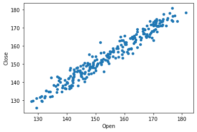
By visualizing price patterns using a scatter plot, it can be inferred that open and close prices are positively correlated. Furthermore, we can generate the same plot using the plt.scatter method.
Method 1
The method one uses the argument data which specifies the data source, whereas the second method directly uses dataframe slicing and hence, there is no need to specify the data argument.
Histogram Plots
A histogram is a graphical representation of the distribution of data. It is a kind of bar graph and a great tool to visualise the frequency distribution of data that is easily understood by almost any audience.
To construct a histogram, the first step is to bin the range of data values, divide the entire range into a series of intervals and finally count how many values fall into each interval.
Here, the bins are consecutive and non-overlapping. In other words, histograms show the data in the form of some groups. All the bins/groups go on X-axis, and Y-axis shows the frequency of each bin/group.
The Python Matplotlib library offers a very convenient way to plot histograms. To create a histogram, we use the hist method of the pyplot sub-module of the matplotlib library. Let us start by creating a simple histogram.
Figure 23
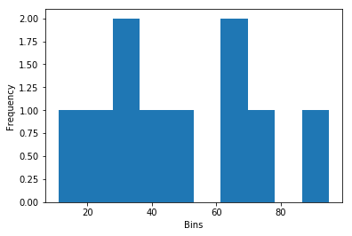
In Python Matplotlib, this is the simplest code possible to plot a histogram with minimal arguments. We create a range of values and simply provide it to the hist method and let it perform the rest of the things (creating bins, segregating each value to the corresponding bin, plotting, etc.).
The hist method also takes bins as an optional argument. If this argument is specified, bins will be created as per the specified value, otherwise, it will create bins on its own.
To illustrate this, we explicitly specify the number of bins in the above code and generate the plot. The modified code and output is shown below:
Figure 24
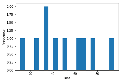
The output we got is very straightforward. Number 32 appears twice in the list y which reflects intuitively. We specify the number of bins to be 20 and hence, the hist method tries to divide the whole range of values into 20 bins and plots them on the X-axis.
Similar to the plot method, the hist method also takes any sequential data structure as its input and plots histograms of it.
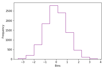
Let us try to generate a histogram of an array in Python Matplotlib which draws samples from the standard normal distribution.
Figure 25
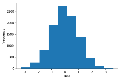
The output we got shows that the data distribution indeed resembles a normal distribution. Apart from bins argument, other arguments that can be provided to hist are color and histtype.
There are lot many arguments that can be provided, but we will keep our discussion limited to these few arguments only. The color of a histogram can be changed using the color argument. The histtype argument takes some of the pre-defined values such as bar, barstacked, step and stepfilled.
The below example illustrates the usage of these arguments.
Figure 26
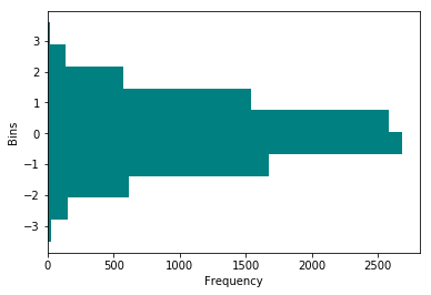
In addition to the optional arguments discussed so far, one argument that needs attention is orientation. This argument takes either of two values: horizontal or vertical. The default is vertical.
Figure 27
We now shift our focus on plotting a histogram directly from a pandas dataframe in Python Matplotlib. Again, the plot method within pandas provides a wrapper around the hist function in Python Matplotlib as it was the case with scatter plots.
To plot a histogram, we need to specify the argument kind with the value hist when a call to plot is made directly from the dataframe. We will be working with the same dataframe data that contains historical data for AAPL stock.
Figure 28
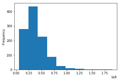
In the first method, we directly make a call to plot method on the dataframe data sliced with Volume column. Whereas in the second method, we use the hist method provided by matplotlib.pyplot module to plot the histogram.
Both methods plot the same result as shown above. In the next section of the Python Matplotlib tutorial, we are going to learn something interesting, how to customise your own plots.
Plot Customization using Python Matplotlib
Now that we have got a good understanding of plotting various types of charts and their basic formatting techniques, we can delve deeper and look at some more formatting techniques.
We already learned that Python Matplotlib does not add any styling components on its own. It will plot a simple plain chart by default. We as a user need to specify whatever customization we need.
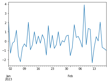
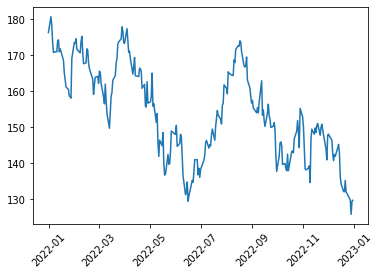
We start with a simple line plot and will keep on making it better. The following example shows the plotting of close prices of the AAPL ticker that is available to us in the dataframe data.
Figure 29
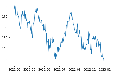
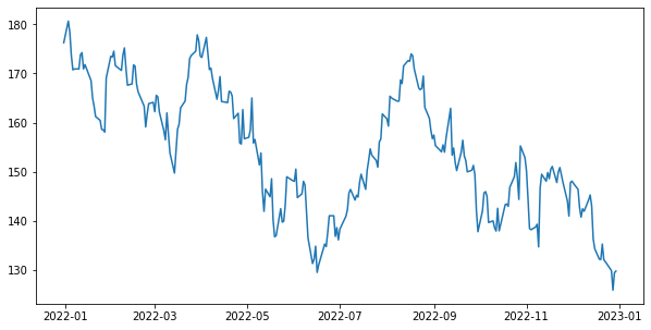
Here, the close_prices is the pandas Series object which gets plotted using the plot method. However, values on the X-axis are something that we don't want. They are all overlapped with each other. This happens as the plot method did not find sufficient space for each date. One way to overcome this issue is to rotate the values on the X-axis to make it look better.
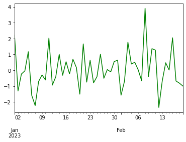
Figure 30
The xticks method along with the rotation argument is used to rotate the values/tick names along the x-axis. Another approach that can be used to resolve the overlapping issue is to increase the figure size of the plot such that the Python Matplotlib can easily show values without overlapping. This is shown in the below example:
Figure 31
Similarly, Python Matplotlib provides yticks method that can be used to customize the values on the Y-axis. Apart from the rotation argument, there are a bunch of other parameters that can be provided xticks and yticks to customize them further.
We change the font size, color and orientation of ticks along the axes using the appropriate arguments within these methods in the following example:
Figure 32
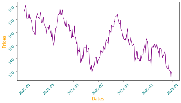
Along with the axes values, we change the color and font size of axes labels. There are numbers of other customization possible using various arguments and Python Matplotlib provides total flexibility to create the charts as per one's desire.
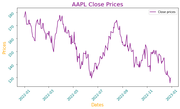
Two main components that are missing in the above plot are title and legend, which can be provided using the title and legends of the method respectively. Again, as with the other methods, it is possible to customize them in a variety of ways, but we will be restricting our discussion to a few important arguments only.
Adding these two methods as shown below in the above code would produce the following plot:
Figure 33
Another important feature in Python Matplotlib that can be added to a figure is to draw a grid within a plot using the grid method which takes either True or False. If true, a grid is plotted, otherwise not.
Figure 34

The axhline method allows us to add a horizontal line across the axis to the plot. For example, we might consider adding the mean value of close prices to show the average price of a stock for the whole duration.
It can be added using axhline method in Python Matplotlib. Computation of mean value and its addition to the original plot is shown below:
Figure 35
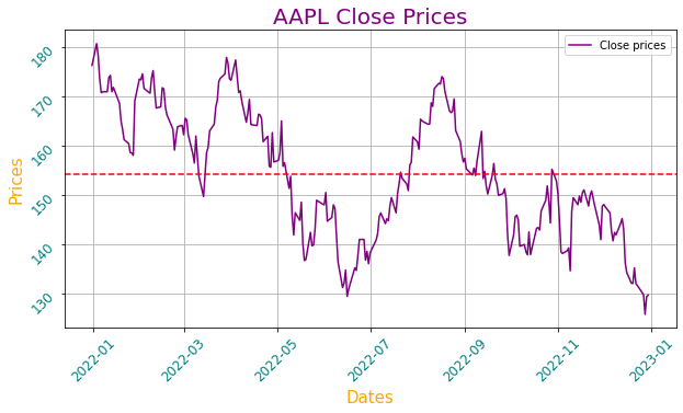
Now that we have the mean value of close prices plotted in the figure, one who looks at the chart for the first time might think what this red line conveys?
Hence, there is a need to explicitly mention it. To do so, we can use the text method provided by matplotlib.pyplot module to plot text anywhere on the figure.
Figure 36
The text method takes three compulsory arguments: x, y and t which specifies the coordinates on X and Y-axis and text respectively. Also, we use a datetime sub-module from a datetime library to specify a date on the X-axis as the plot we are generating has dates on the X-axis. The chart with text indicating the mean price is shown below:

Using all these customization techniques, we have been able to evolve the dull-looking price series chart into a nice and attractive graphic which is not only easy to understand but presentable also. However, we have restricted ourselves to plotting only a single chart.
Let us brace ourselves and learn to apply these newly acquired customization techniques to multiple plots.
Multiple plots using Python Matplotlib
We already learned at the beginning of this Python Matplotlib tutorial that a figure can have multiple plots, and that can be achieved using the subplots method.
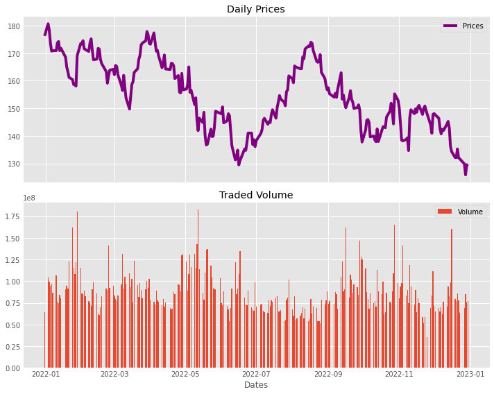
The following examples show stock prices of AAPL stock along with its traded volume on each day.
Figure 37
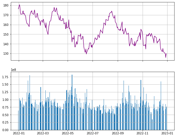
First, we extract the Volume column from the data dataframe into a volume which happens to be a pandas series object. Then, we create a figure with sub-plots having two rows and a single column. This is achieved using nrows and ncols arguments respectively.
The sharex argument specifies that both sub-plots will share the same x-axis. Likewise, we also specify the figure size using the figsize argument. These two subplots are unpacked into two axes: ax1 and ax2 respectively. Once, we have the axes, desired charts can be plotted on them.
Next, we plot the close_prices using the plot method and specify its color to be purple using the color argument.
Similar to the plot method, Python Matplotlib provides bar method to draw bar plots which takes two arguments: the first argument to be plotted on the X-axis and second argument to be plotted along the y-axis.
For our example, values on X-axis happens to be a date (specified by volume.index), and value for each bar on the Y-axis is provided using the recently created volume series. After that, we plot grids on both plots. Finally, we display both plots.
As can be seen above, Python Matplotlib rendered a decent chart. However, it misses some key components such as title, legends, etc.
Figure 38
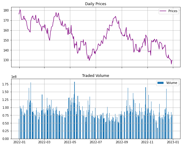
Here, we use the legend method to set legends in both plots. Legends will print the values specified by the label argument while plotting each plot.
The set_title is used to set the title for each plot. Earlier, while dealing with a single plot, we used the title method to set the title. However, it doesn't work the same way with multiple plots.
Another handy method provided by Python Matplotlib is the tight_layout method which automatically adjusts the padding and other similar parameters between subplots so that they fit into the figure area.
The above code explicitly specifies the layout and the label on the x-axis which results in the following chart.
Figure 39
In addition to all this customization, Python Matplotlib also provides a number of predefined styles that can be readily used. For example, there is a predefined style called “ggplot”, which emulates the aesthetics of ggplot (a popular plotting package for R language).
To change the style of plots being rendered, the new style needs to be explicitly specified using the following code:
One the style is set to use, all plots rendered after that will use the same and newly set style. To list all available styles, execute the following code:
Let us set the style to one of the pre-defined style known as 'fivethirtyeight' and plot the chart.
Figure 40
By changing the style, we get a fair idea of how styles play an important role to change the look of charts cosmetically while plotting them.
The last method that we will study is the savefig method which is used to save the figure on a local machine. It takes the name of the figure by which it will be saved. This is illustrated below:
Executing the above code will save the chart we plotted above with the name AAPL_chart.png.
Conclusion
Thus, in this Python Matplotlib tutorial, we started with the basics of figures and plots, gradually learning various types of charts and their nitty-gritty along the way, and finally, we learned customization and took a sneak-peek into plotting multiple plots within the same chart.
To reiterate, the Python Matplotlib tutorial is an excerpt from the Python Basics Handbook, which was created for both; beginners who are starting out in Python as well as accomplished traders who can use it as a handy reference while coding their strategy.
If you need to know more about Matplotlib and data visualization with Python, learn all about it with our informational courses in the learning track on Algorithmic Trading for Beginners.
Note: The original post has been revamped on 22nd June 2023 for accuracy, and recentness.
Disclaimer: All data and information provided in this article are for informational purposes only. QuantInsti® makes no representations as to accuracy, completeness, currentness, suitability, or validity of any information in this article and will not be liable for any errors, omissions, or delays in this information or any losses, injuries, or damages arising from its display or use. All information is provided on an as-is basis.