By Rekhit Pachanekar and Shaktiprasad Shimpi
Before going into the specifics of Plotly Python, let me ask you a question. If you have to go someplace, which of the following would you prefer:
- Your relative telling you to drive straight for 15 kms, then take a left at 6th Avenue, then right, then a slight left and drive for 10 minutes to reach the destination
- A map with the route highlighted.
Obviously, we would prefer a map as it is easier to reference. In a similar manner, we prefer bar charts and plots over tables to give us a better way to compare different entities. And Plotly Python does just that!
Plotly Python is a library which helps in data visualisation in an interactive manner. But you might be wondering why do we need Plotly when we already have matplotlib which does the same thing. Plotly was created to make data more meaningful by having interactive charts and plots which could be created online as well. The fact that we could visualise data online removed a lot of hurdles which are associated with the offline usage of a library. However, Plotly can be used as both, an offline as well as online tool, thus giving us the best of both worlds.
Let us see the different aspects of Plotly in this blog. The topics covered are as follows:
- Introduction
- How to install Plotly in Python
- Online Vs Offline Usage
- Rendering as an HTML file or in the Notebook
- OHLC Chart
- Scatter Plot
- Line Chart using Plotly Express
- Histogram
- Contour Charts
- Scatter Plot in 3D
Introduction
If you go through the objectives of the company which developed Plotly, you will find that it can be broadly divided into three parts:
- To make visualising data more interactive and intuitive
- To make the graphing capabilities of a the library available in an online environment as well
- To truly make data science tools open source and accessible to everyone.
In fact, the charts created by using plotly have the unique feature that when you hover on the individual element on the graph, the number associated with the figure comes up.
According to its official website, Plotly has support for over 40 chart types and can even be used for 3 dimensional use cases. Considering the collaborative environment of Python, the company behind the library has kept the library open source and free so that it can be beneficial for everyone.
The plotly python library consists of the following packages:
- plotly: This is the main package which contains all the functionality
- graph_objs: This package contains objects, or templates of figures which are used for visualising
- matplotllib: The interesting thing about plotly is its support matplotlib figures as well
Let us now begin our journey in the world of plotly by first installing it.
How to install Plotly in Python
The great thing about Python is we can easily install most of the packages using the ‘pip’ command. Thus, the python code is as follows:
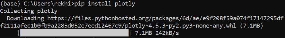
pip install plotly
You can use it in the Anaconda terminal as shown below:
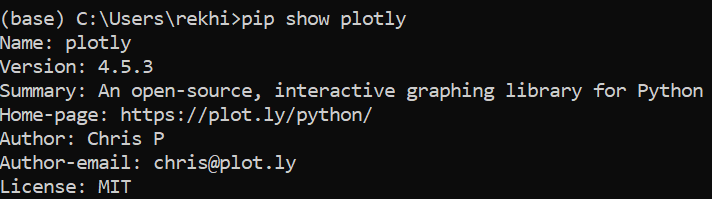
If you want to check the version of plotly installed, you can use the following command
pip show plotly
You will find the output as shown below:
Plotly also contains an “express” feature which makes it even easier to create graphs and objects.
Online Vs Offline Usage
Initially, the creators of plotly had given both online and offline capabilities for users of the plotly package, but it led to confusion on how the graphs were rendered. Thus, starting with version 4, the creators used the offline capabilities as default and bundled the online capabilities in a new package called “chart-studio”.
We are going to focus on the offline version for this blog. There are two ways to use Offline plotting of Plotly Python. Let’s see them now
Rendering as an HTML file or in the Notebook
We will first see how we can use the plots as a seperate html file.
Creating an HTML file (plotly.offline.plot)
We use plotly.offline.plot() to create a standalone HTML file of the plot or chart. This html file can be saved and rendered in any web browser.
A sample code of a graph with the x axis and y axis elements is given below:
As we have written the optional code “auto_open=True”, this will open a new browser tab with the graph.
We will now see how to render it in the python notebook itself.
Jupyter notebook
We use the command plotly.offline.iplot() when working offline in a Jupyter Notebook. This will generate the graph or plot in the same notebook itself.
The same graph will be plotted with the following code:
Great! With this out of the way, let us now see the various kinds of cool figures we can make by using Plotly. Since line charts were done on basic numbers, we will see how we can plot the Closing price of Tesla by using the Plotly Python library now.
OHLC Chart
Initially we will use Yahoo finance to download the OHLC data of Tesla from 1st February 2020 to 3 March 2020.
The python code for importing the libraries as well as the OHLC data is as follows
The python code for plotting the OHLC data is given below:
You can see the OHLC data plotted as follows:
As we have seen before, the great thing is you can hover at any candlestick pattern and get the data of the respective day. Try it out on the plot above.
Let us now try plotting the scatter plot of Tesla and Apple daily percentage changes using plotly.
Scatter Plot
Usually, a scatter plot is used as a visual of the correlation between two entities. Here, we will try to see if there is any correlation between the Adjusted Closing prices of Tesla and Apple, respectively.
Since we had used the data of Tesla from 1 February to 3 March. We will import the data of the same time frame.
Thus, the Python code for importing the Apple data is as follows:
Now, we will calculate the percentage change of both Tesla and Apple and store it in a new column as “Percentage Change”
The scatter plot is given below:
Awesome! Here’s a fun idea. Why don’t you plot the results for a whole year of data? You can let us know in the comments what inference you could gather from it.
Line Chart using Plotly Express
Earlier, we saw how to create a scatter plot using the good old Plotly Python library. We also plotted a line chart using Plotly. But there is another way to plot a line chart. And that is, Plotly express. Plotly express can be used to reduce your lines of code by a large margin.
Let us see the python code for line charts:
The graph created is as follows:
You can use plotly express for a lot more things than just a line chart. If you are interested in knowing more about Plotly express, head on over to their official documentation.
Now, we have seen how the OHLC data is represented. Can we find the frequency of the percent change. Let’s try to plot a histogram using Plotly Python now.
Histogram
We will use Plotly Express to plot the histogram of percentage change of Tesla. The Python code is as follows:
The Output is given as follows:
Of course, since we do not have many data points, the histogram will not exactly have a normal distribution.
All right, let us try another cool looking chart, which we call the contour chart.
Contour Charts
Contour charts were initially created to understand the topography of a landmass in a 2d format. We have all seen google Earth, right. How if you zoom in on a certain mountain, it shows the height changes as you get closer to the peak. That’s exactly it.
Plotly has conveniently given us a way to plot a histogram in a contour format. Let us use the percentage change in the daily values of Tesla and Apple as our x and y variables.
The code is as follows:
The contour chart created is as follows
Here, you can say that the central point shows the maximum occurence of the percentage change of the two stocks. You can always use the contour map to compare the daily percentage change of any two stocks to find any common occurrence.
Scatter Plot in 3D
We will use the OHLC data of Tesla for creating this plot. The python code is as follows:
The 3d scatter plot is as follows:
You can deduce that for most of the days, the volume remained below 20M but the Closing price kept fluctuating wildly. While we did not need a 3d scatter plot to come to this conclusion, it is easier to do so when presented with a diagram like this.
Fascinated by the third dimension? Do let us know in the comments how you would like to use the 3d plots in your trading analysis.
Conclusion
We have seen how intuitive and interactive plots and charts such as Line charts, OHLC data in the form of trading candlestick patterns, histograms and also Contour charts using Plotly Python in this article. Plotly also gives you the option to save the charts in a stand-alone html file which can rendered on any web browser as well as different languages too. We can use Plotly Python in our endeavour to analyse financial data and improve our strategies.
Do check out the Quantitative strategies and Models course on Quantra to create and execute trading strategies and also improve your financial knowledge.
You can also check out our blog on Popular Python Libraries For Algorithmic Trading to learn more about various python libraries.
Disclaimer: All investments and trading in the stock market involve risk. Any decisions to place trades in the financial markets, including trading in stock or options or other financial instruments is a personal decision that should only be made after thorough research, including a personal risk and financial assessment and the engagement of professional assistance to the extent you believe necessary. The trading strategies or related information mentioned in this article is for informational purposes only.